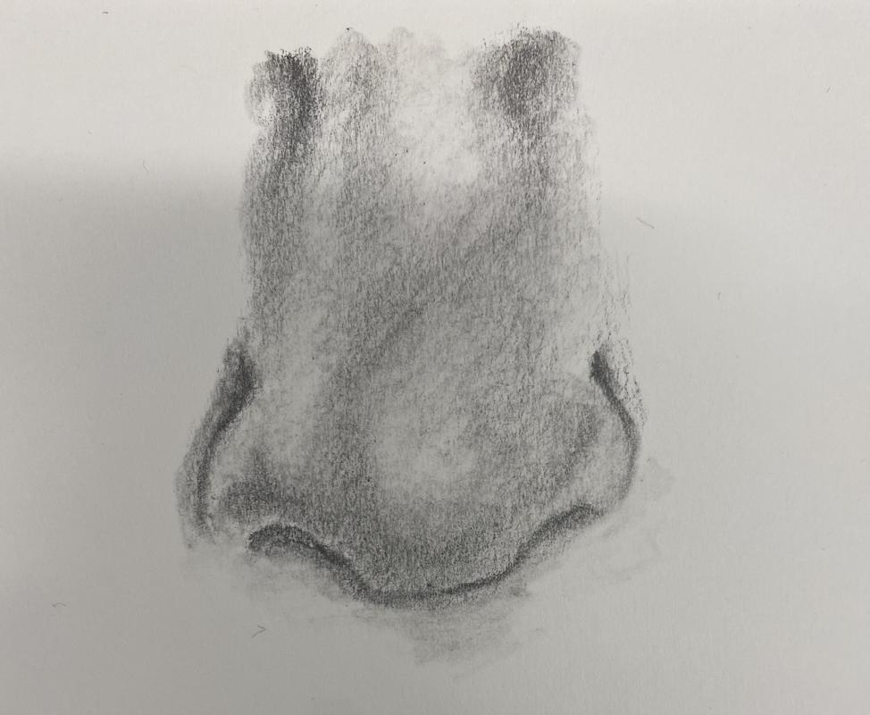
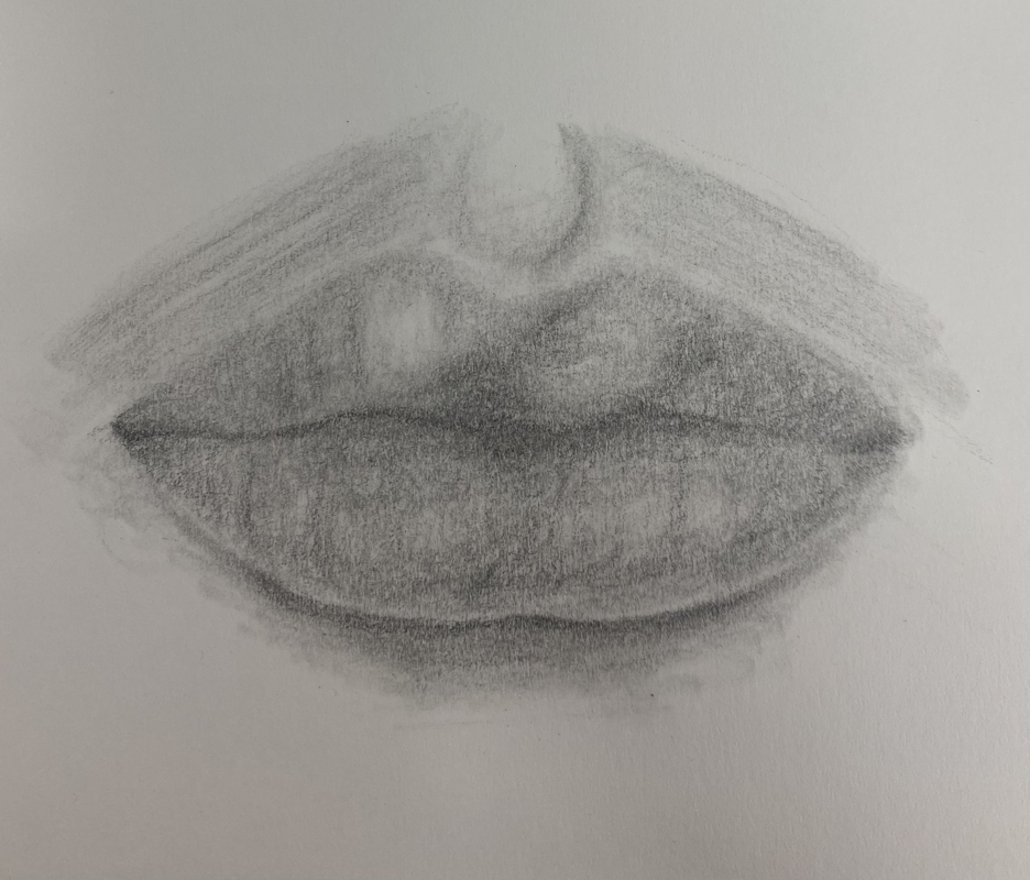
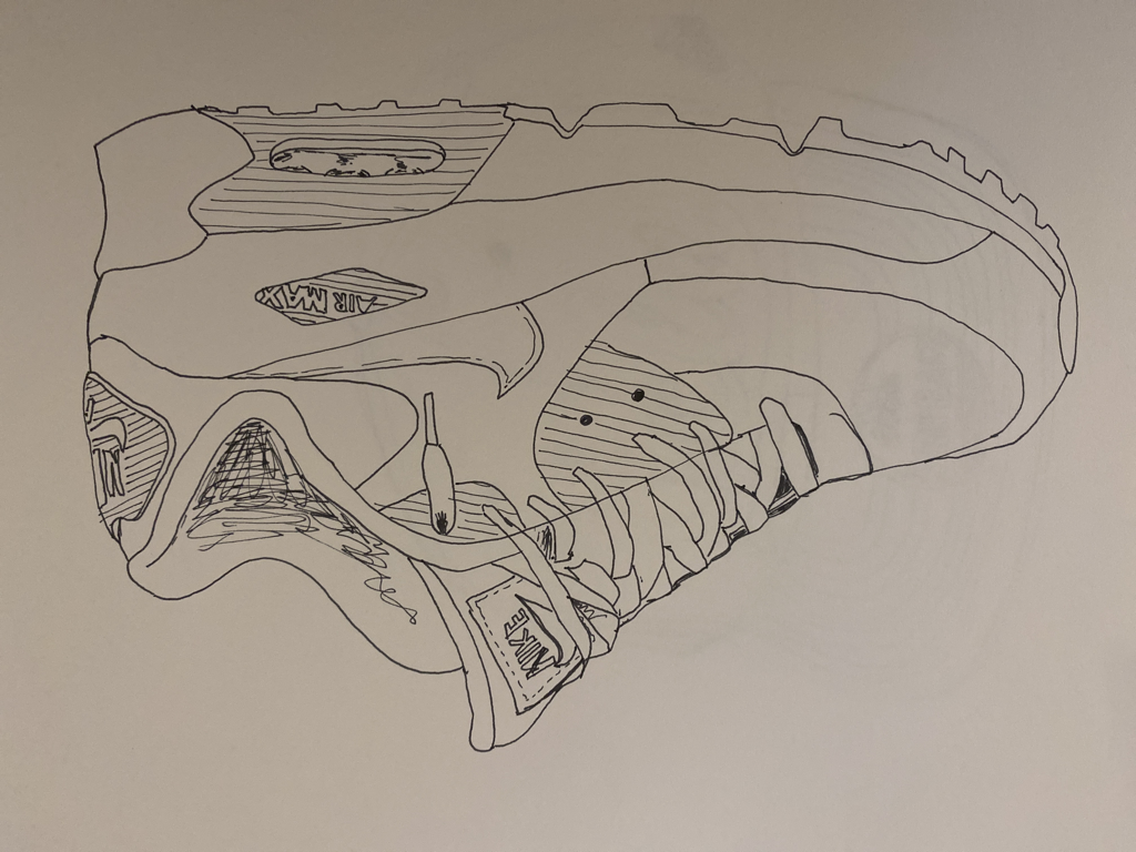
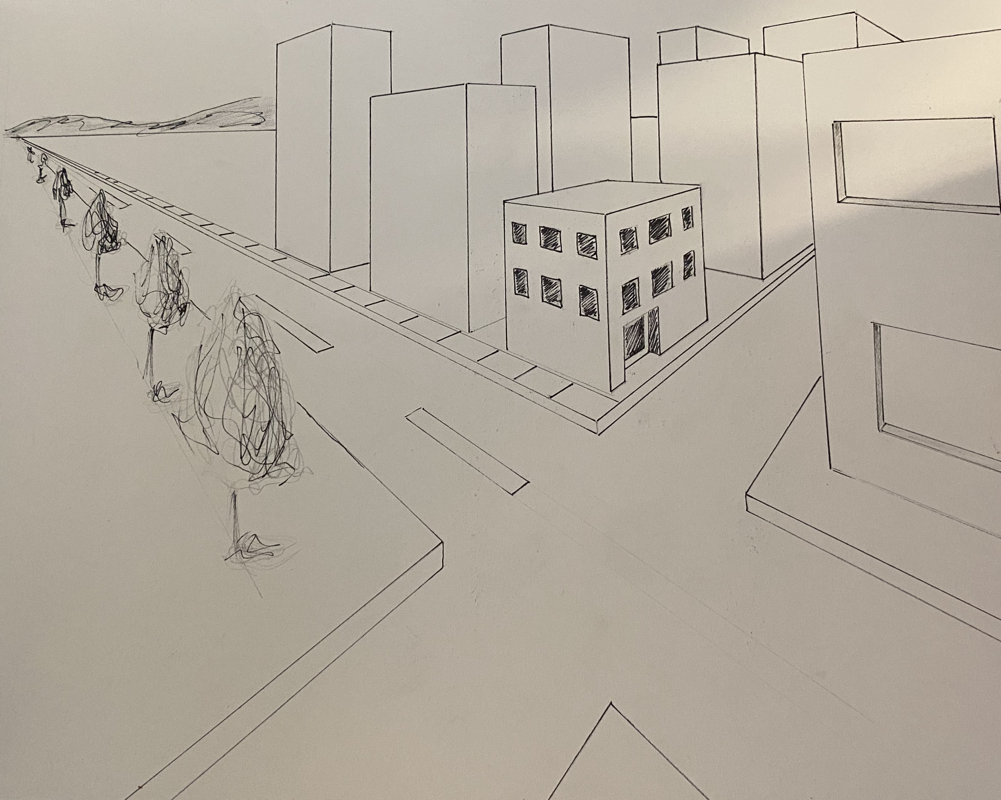
4 ASSESMENT DRAWINGS
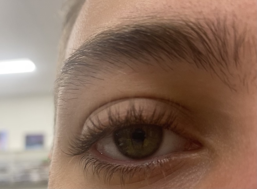
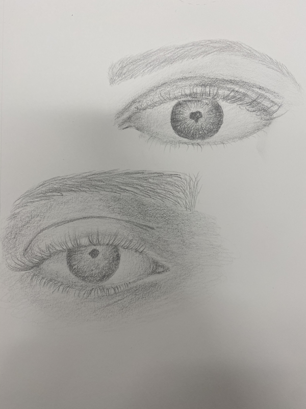
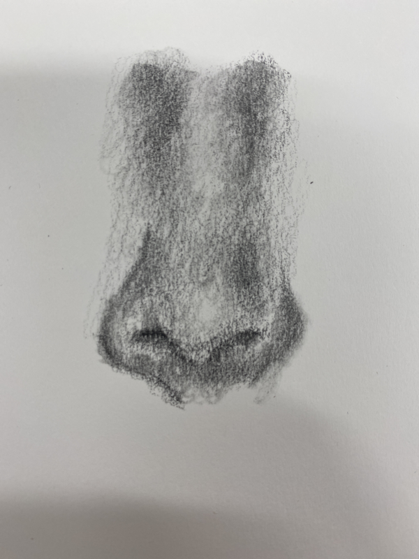
My 4 assessment drawings include a one-point view of a street, a portrait of me, a shoe, and a hand. This project was done so that miss Rossi could get an idea of the level I am at in art.
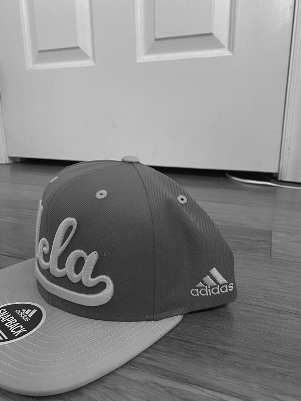
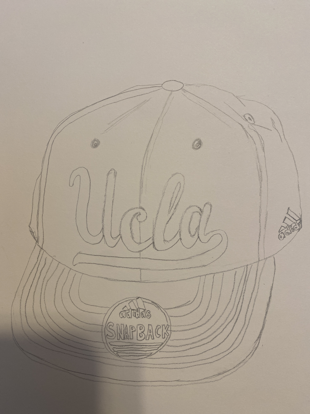
PHOTOGRAPHY
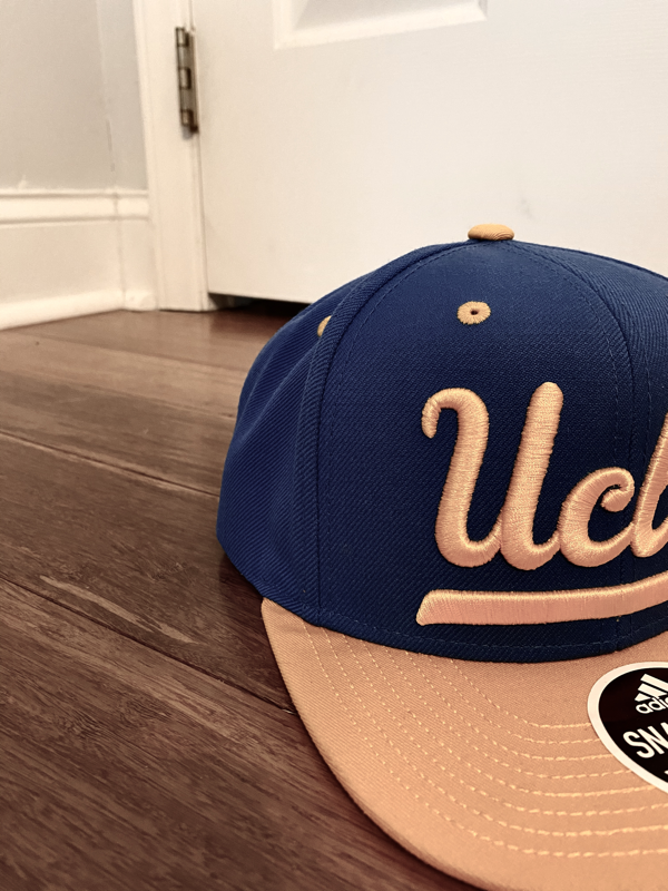
First is my 9 practice photos. That is my favorite hat and I tried to use the skills we learned in class about composition in the pictures. Next is my final three photographs. The theme is online school so I used my computer in the photos. I also put a mask because corona is the reason we are doing online school. I tried to give the photos a lonely/cozy feeling because that is what online school feels like. I edited the pictures to make that feeling more intense. The main colors I went with for my 3 main photos was black and white because I feel like it gives a lonely cozy vibe. My pictures may seem kind of similar but they have variety because they all have a different piece in them. For example... the cat, me, and the mask.
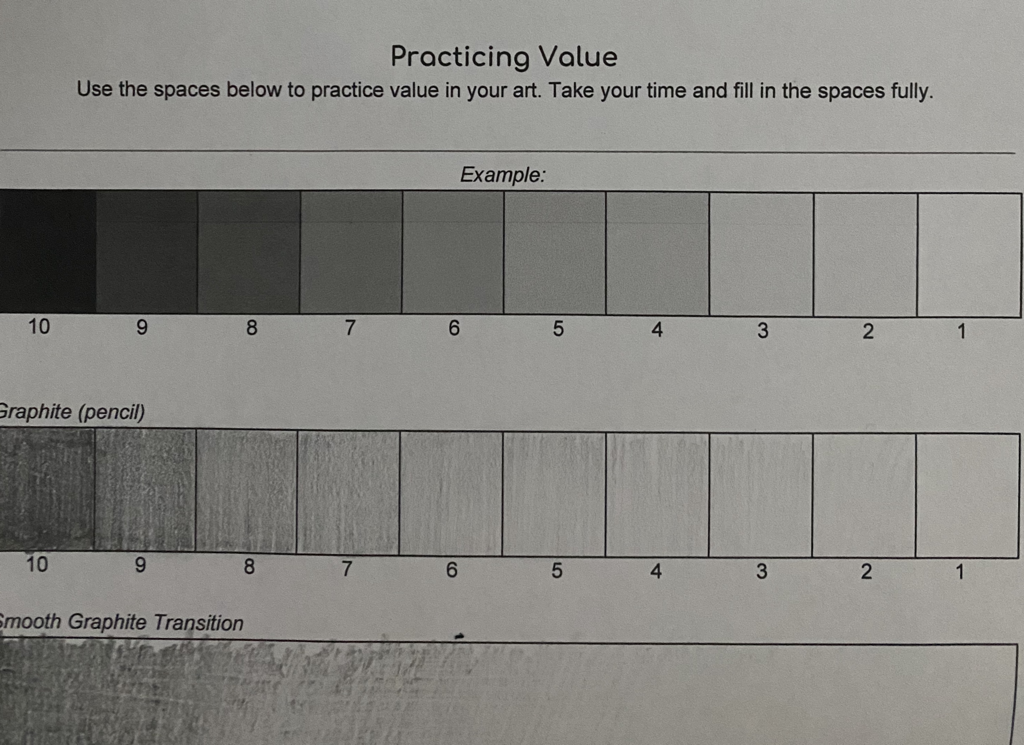
Value chart
Value is done to show dimension. This chart helps us practice shading. The key to value is making the change in darkness gradual.
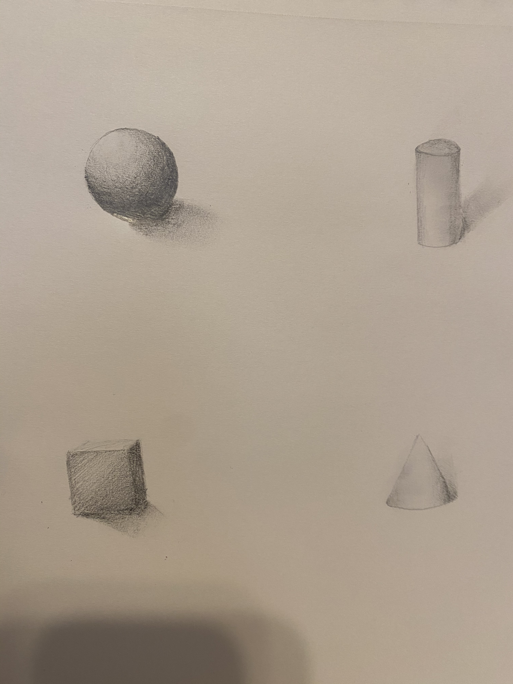
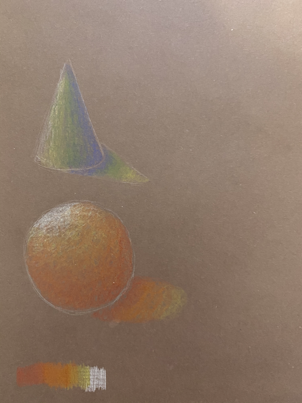
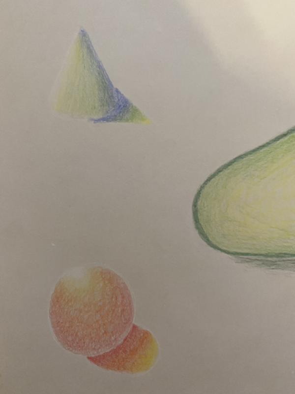
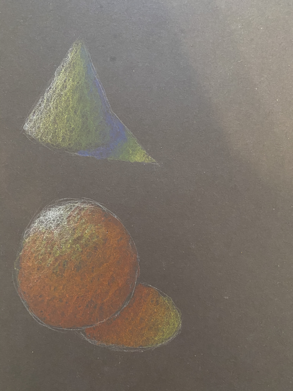
Shaded forms
These are 4 shapes drawn on a paper so they are 2 dimensional, however shading them makes them look 3-dimensional.
Contour drawings of 4 objects
These 4 drawings were drawn without picking my tool(pencil/ pen) up.
Contour drawings of 2 objects
Contour drawings are pretty much an outline of objects usually without picking up your pencil/ pen. I most of these drawings were done that way but I did pick it up a couple times. Each drawing took 20 minutes. It was difficult to draw for 20 minutes because you do not shade a contour drawing.
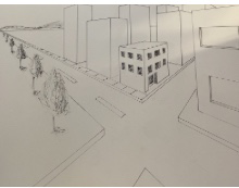
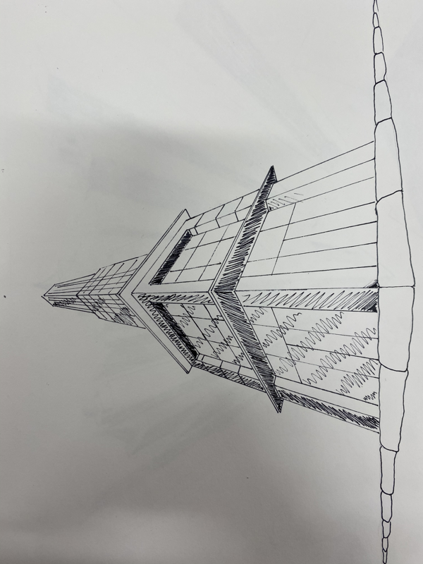
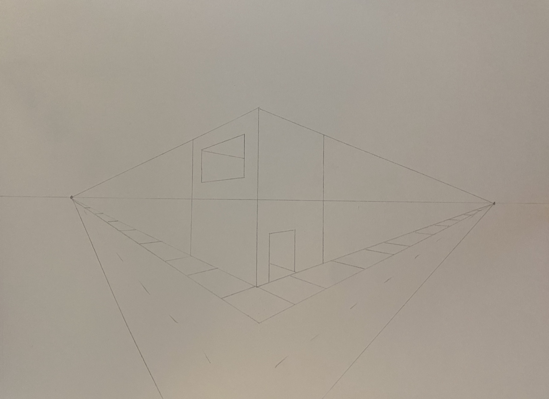
Perspective
1-point
I watched 2 videos about how to draw one-point perspective and followed the artist.
2-point
The first 2 drawings are from YouTube tutorials that I followed and the last was practice that we did in class before we started the tutorial videos
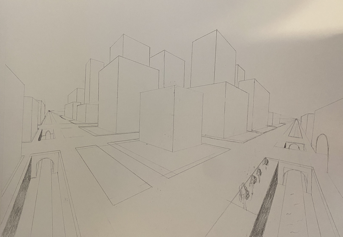
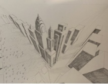
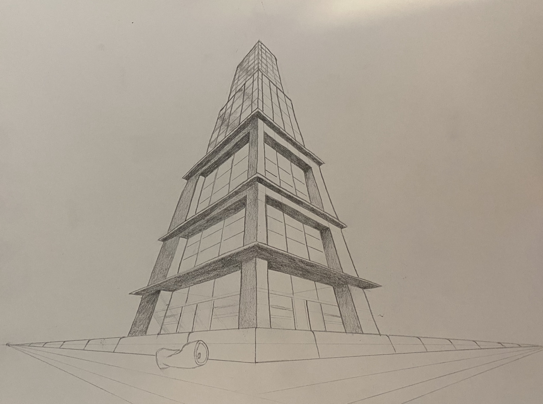
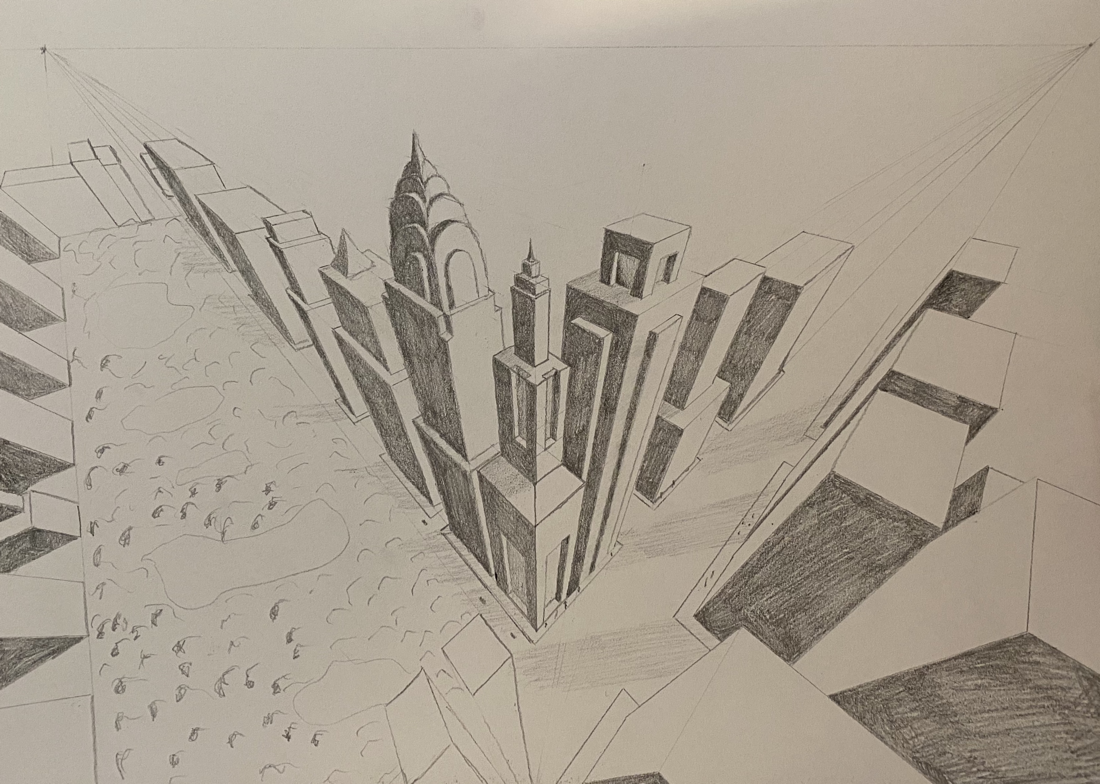
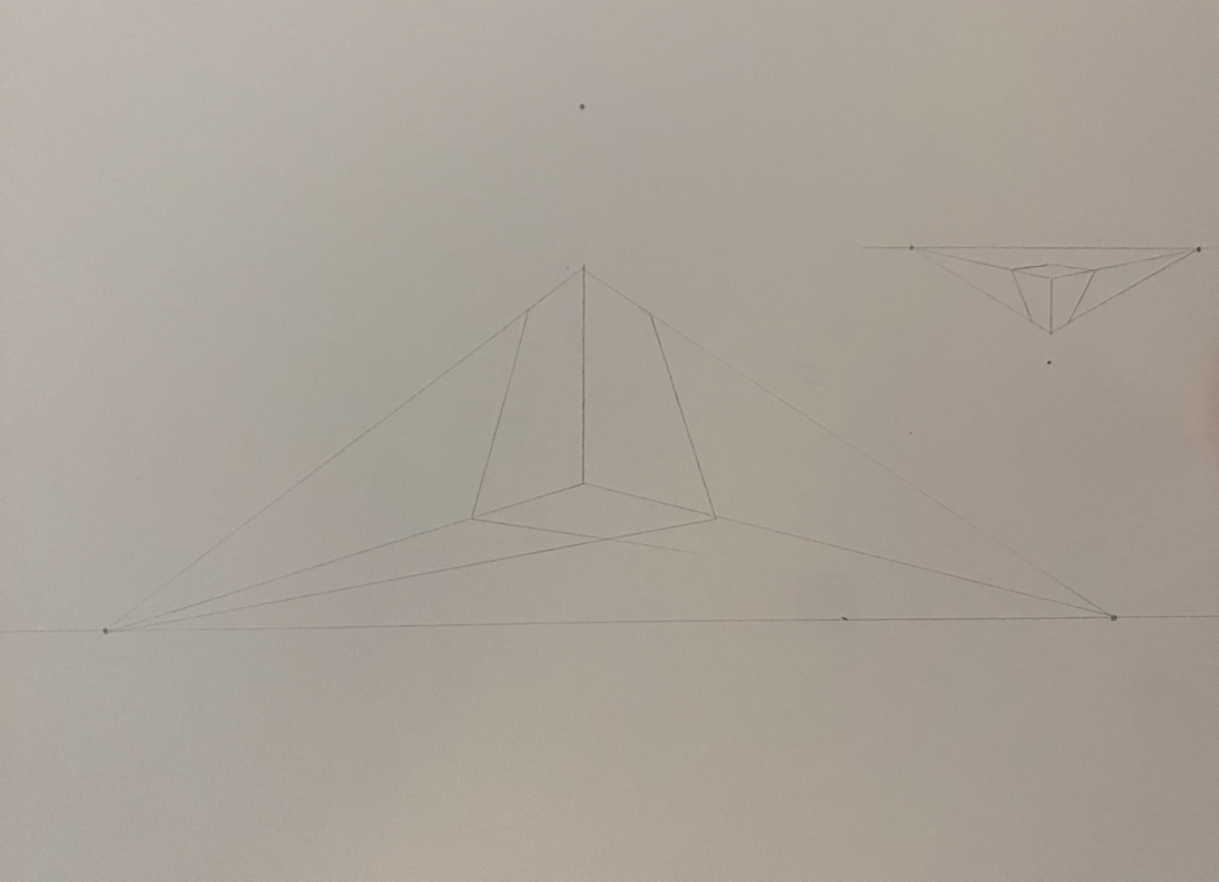
3-point
The first drawing was from a YouTube video tutorial that showed how to draw a building from worms eye view. The next was a video tutorial that showed how to draw a city from birds eye view. And the last is practice from before we started the tutorial videos.
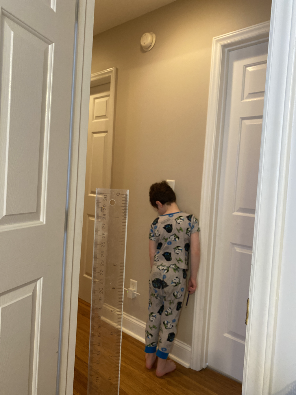
Forced perspective
For this assignment we took 4 photos in forced perspective and picked our favorite. This is my favorite because it makes my little brother look like he is only 8 inches tall.
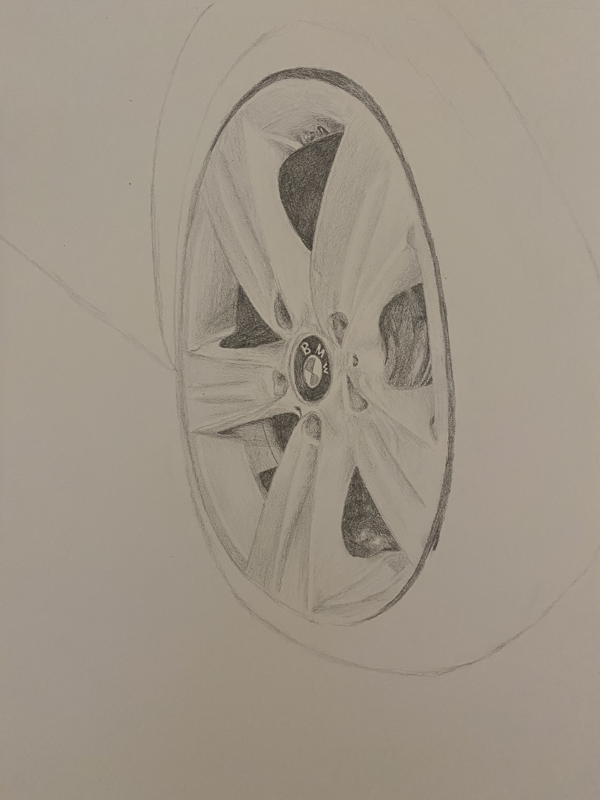
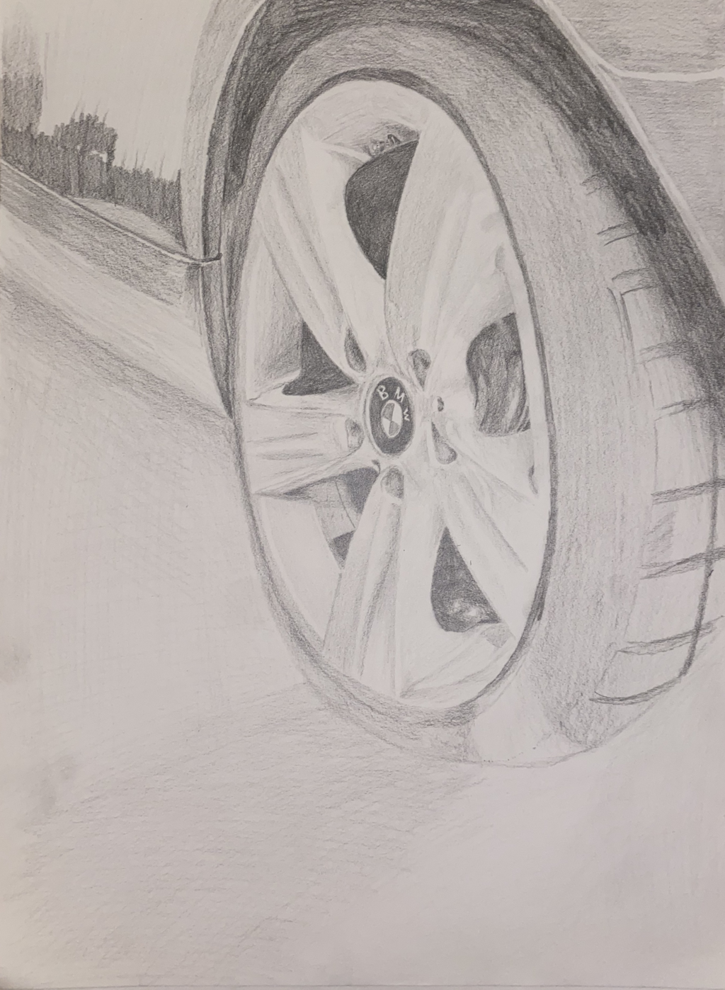
UNSEEN THINGS
Sketches
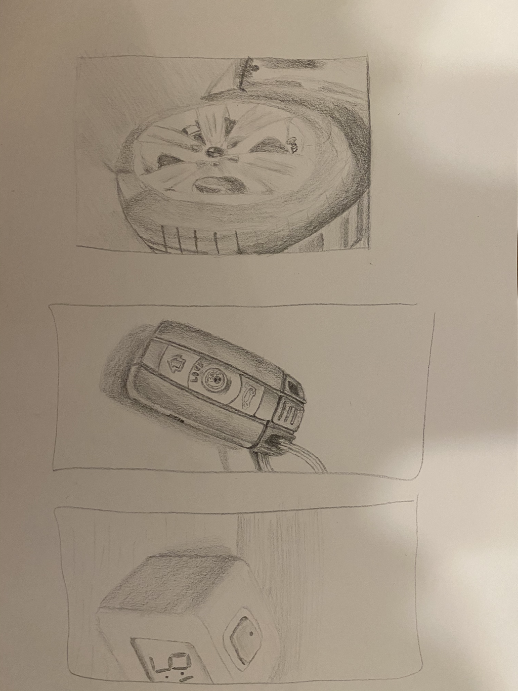
In progress
PEN AND INK
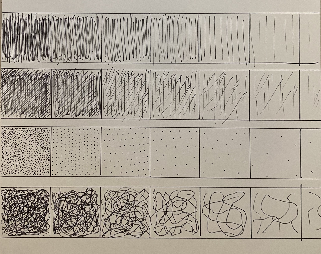
This is 4 different value carts with 4 different techniques of pen value (hatching, cross hatching, stippling, and random line)
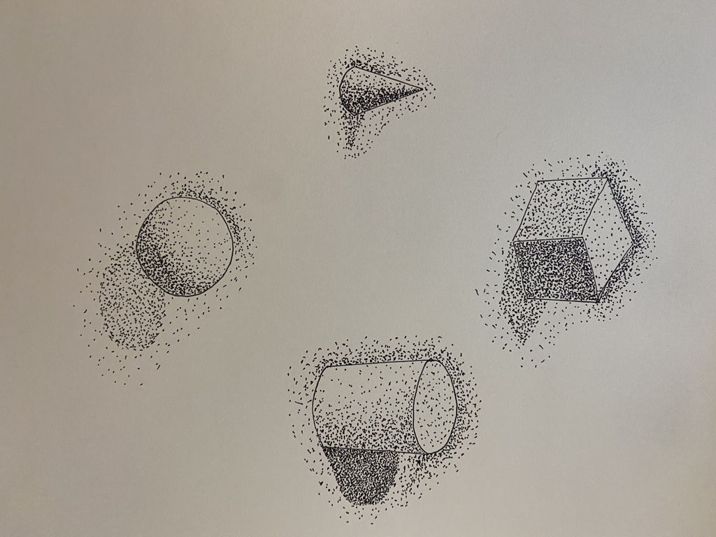
We were given 4 shapes that had value with stippling and we told to recreate them. I was in the mountains so I was not able to print the original worksheet.
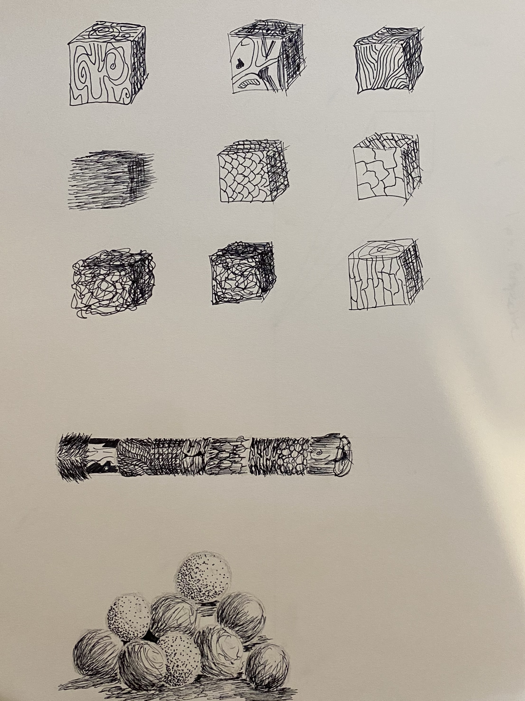
3 texture video drawings
We watched three pen technique tutorial videos on YouTube and followed along with the artist
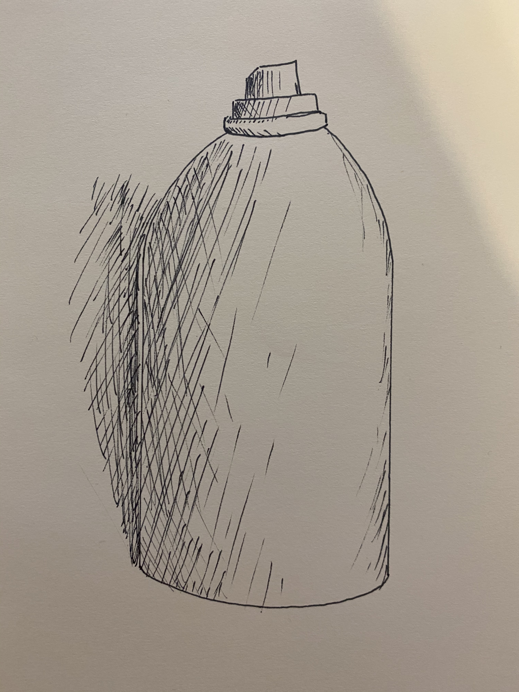
This is a drawing of an object that we sketched with pencil then finished it off by adding pen value
Pen Perspective project
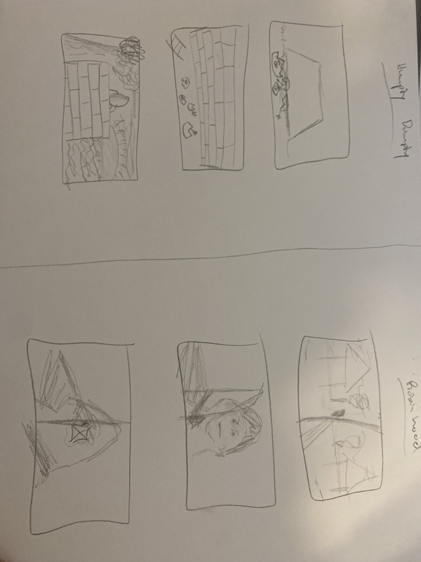
-broken hungry dumpty
-ginger bread man running
-ala’adin on flying carpet
-robinhood
-ginger bread man running
-ala’adin on flying carpet
-robinhood
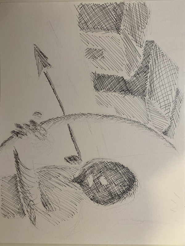
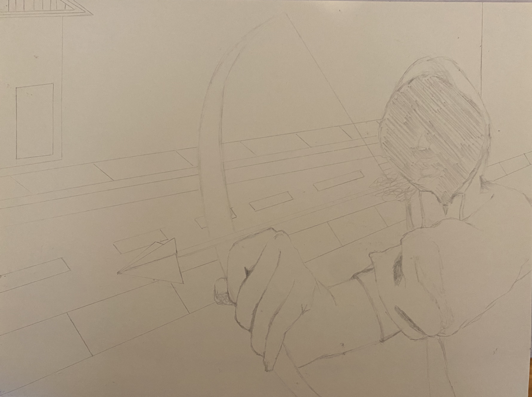
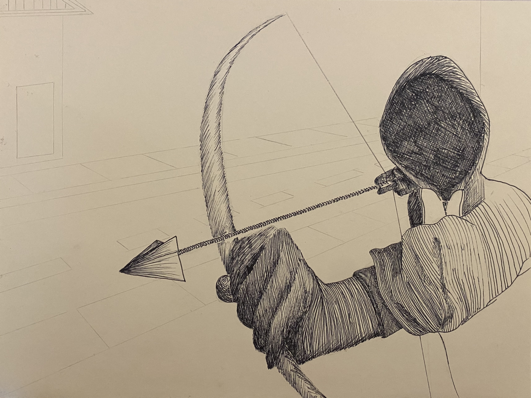
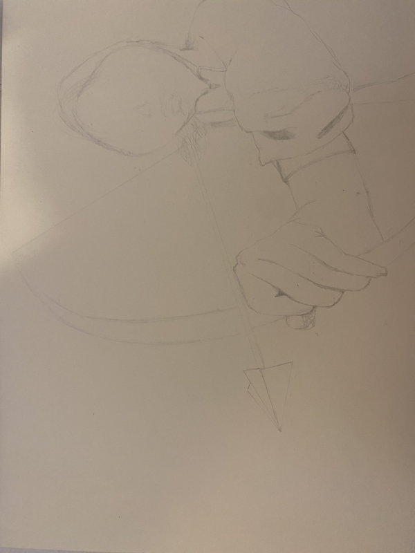
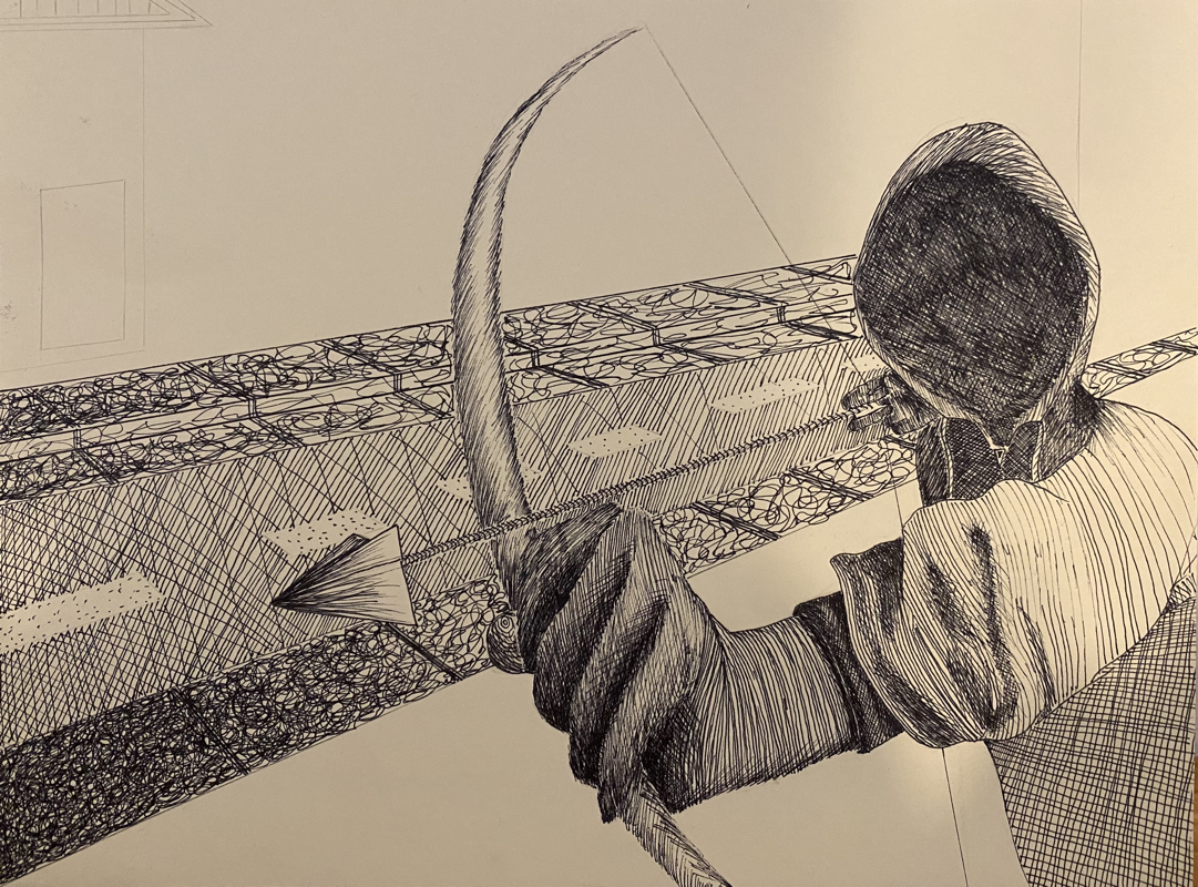
Final Drawing
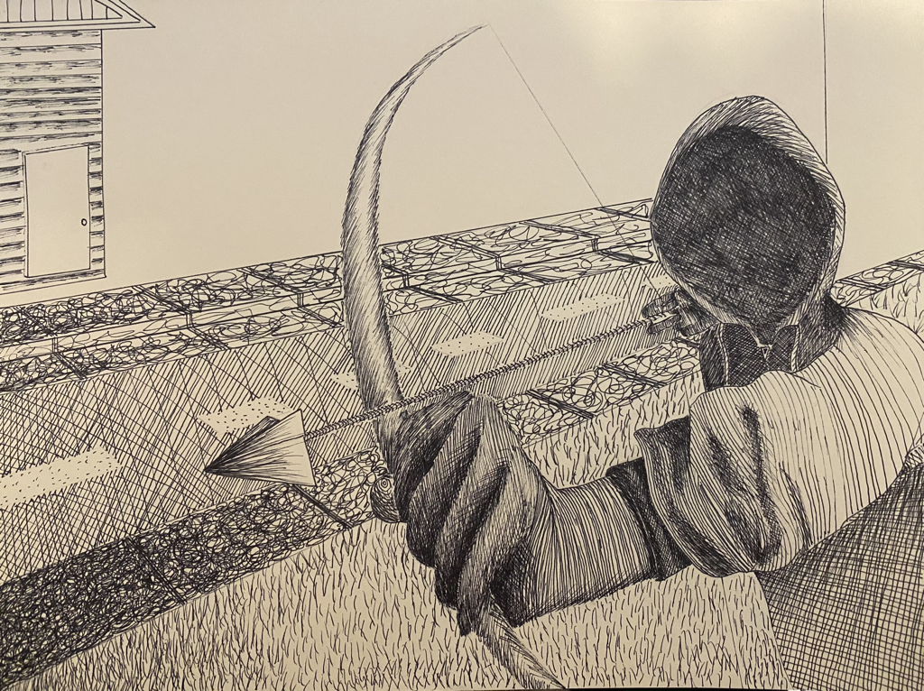
1. I chose to use multiple techniques. Most were random but in some areas like the face I chose cross-hatching because it was the easiest technique to make an area as dark as possible quick.
2. I chose this perspective because I thought it was cool how the arrow looks like it is coming in your direction. Also there is a light source in the background which makes his face a shadow.
3. It can make certain aspects look more realistic. For example the value and the texture of the grass.
4. Without value the drawing would look 2D and unrealistic.
5. I think I showed value very well, however, it was hard to create an image from your mind.
6. I would not use as many different techniques. I would try to just use hatching and cross-hatching.
7. I did robinhood. I made him a real boy and a regular zip-up hoodie.
8. If you do not understand the techniques well then you will not be able to execute them well and your artwork will not be the best it could be.
9. I think all these tech Ives will help me in the future because it does not only work with pen.
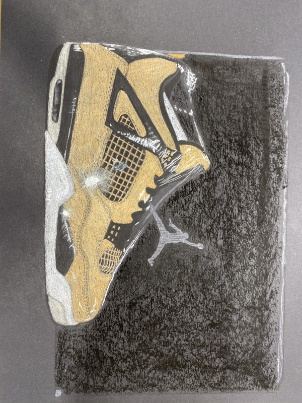
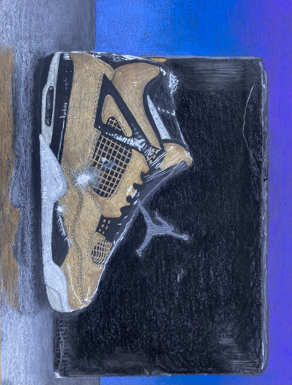
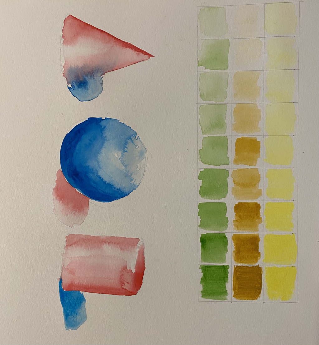
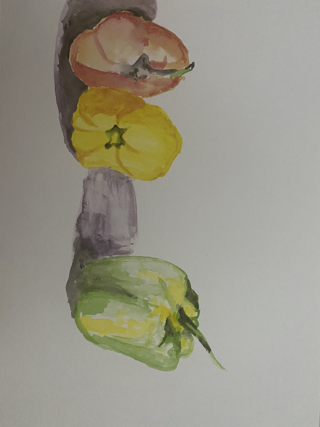
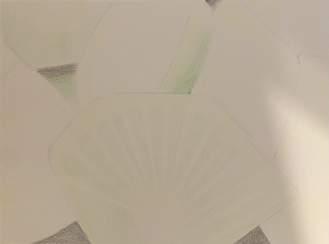
Colored Pencil/ Watercolor
I was exempt from the water color techniques because I did not have the supplies at that point.
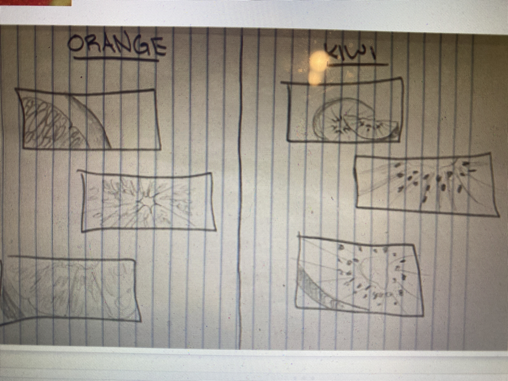
O’Keeffe
-kiwi
-butterfly wing
-orange peel skin
-flower stem
-inside tomato
-sunflower
-corn
-green leaf
-tree bark
-butterfly wing
-orange peel skin
-flower stem
-inside tomato
-sunflower
-corn
-green leaf
-tree bark
In-progress

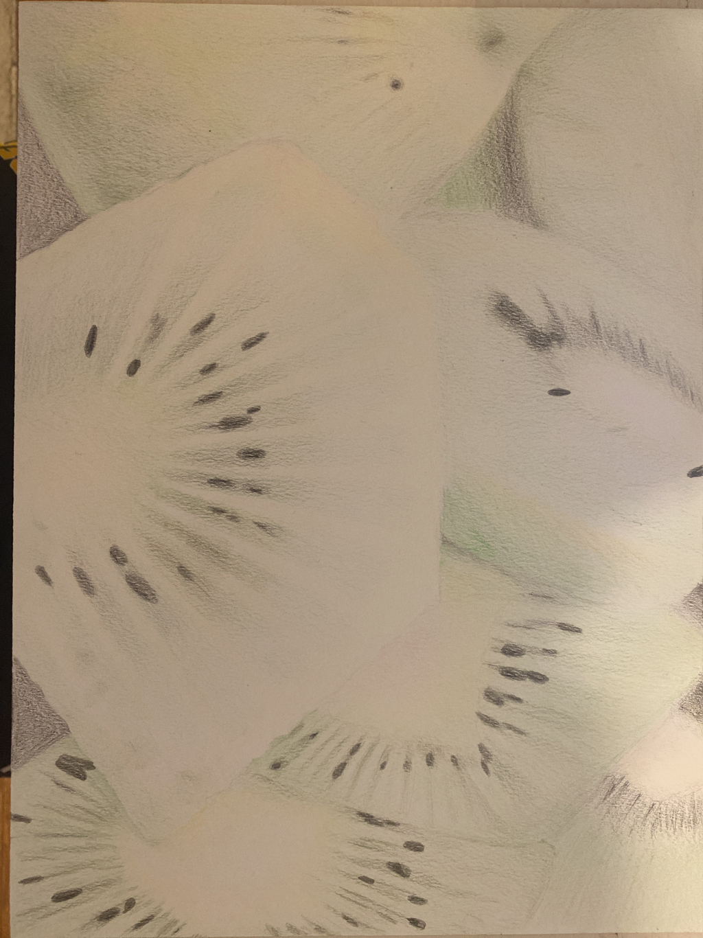
1.I only used colored pencils so I didn’t have many different options for technique. I used a mixture of drawing in a circular motion and straight lines to create value and blend between colors.
2. Very important it created depth.
3.yes, because it isn’t too “busy” or symmetrical.
4. Yes, I mostly used different greens but I threw in some really light pinks yellows and oranges.
5.she drew things very up-close and made them look somewhat abstract so I didn’t the same except it is not too abstract because you can easily tell the drawing is of kiwis.
6.I think my craftsmanship was very neat.
7.I would say it is a bit too dull.
8. I would have done more layers so that it wasn’t as light.
9. I learned many new techniques about how to get the best effect with watercolor and things I didn’t know about water color like that you should do multiple layers to make it more bright/vibrant.
COLLAGE
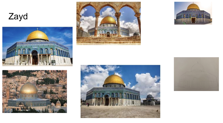
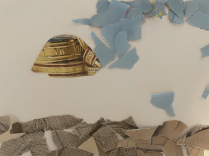
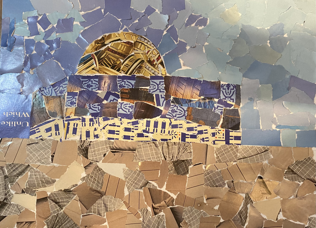
1. I chose this because as a Palestinian I love to make drawings of where I’m from. And it’s interesting because this is one of the most important/ holy sites in Islam.
2. I think my proportions are reasonably accurate and the best shading is in the sky.
3. In the upper( blue) part of the masque, I used pieces with patters like how the actuall mosque has patters on it.
4. I used pieces that fit so that there where little to no white spaces.
5. I think the sky has the most value it was definitely a lot harder to show value on the ground and mosque itself
6. I think it is very neat because I kept the pieces in the lines (of my sketch).
7. I would do a different sky like a sunset with purples and pinks.
